TL;DR:
- Split toning applies separate colors to highlights and shadows, adding cinematic mood without altering overall exposure.
- This guide breaks down exactly how to apply split toning, step by step.
- It also covers the most effective color pairings for different photography genres.
- Aftershoot Edit now includes manual Color Grading controls, letting you dial in your split-tone recipe directly in-app.
- Improved white balance consistency ensures your split-toning style scales accurately across an entire gallery.
Defining your visual aesthetic is a major part of running a photography business. Split toning gives you direct control over that look, allowing you to tint highlights and shadows independently to create a specific mood and add depth. The key to making this technique work for you is finding a way to apply those precise color grades consistently across massive galleries while protecting your time.
Here’s what you actually need to know about split toning, from executing the technique properly to automating it across your workflow.
What Does Split Toning Actually Do?
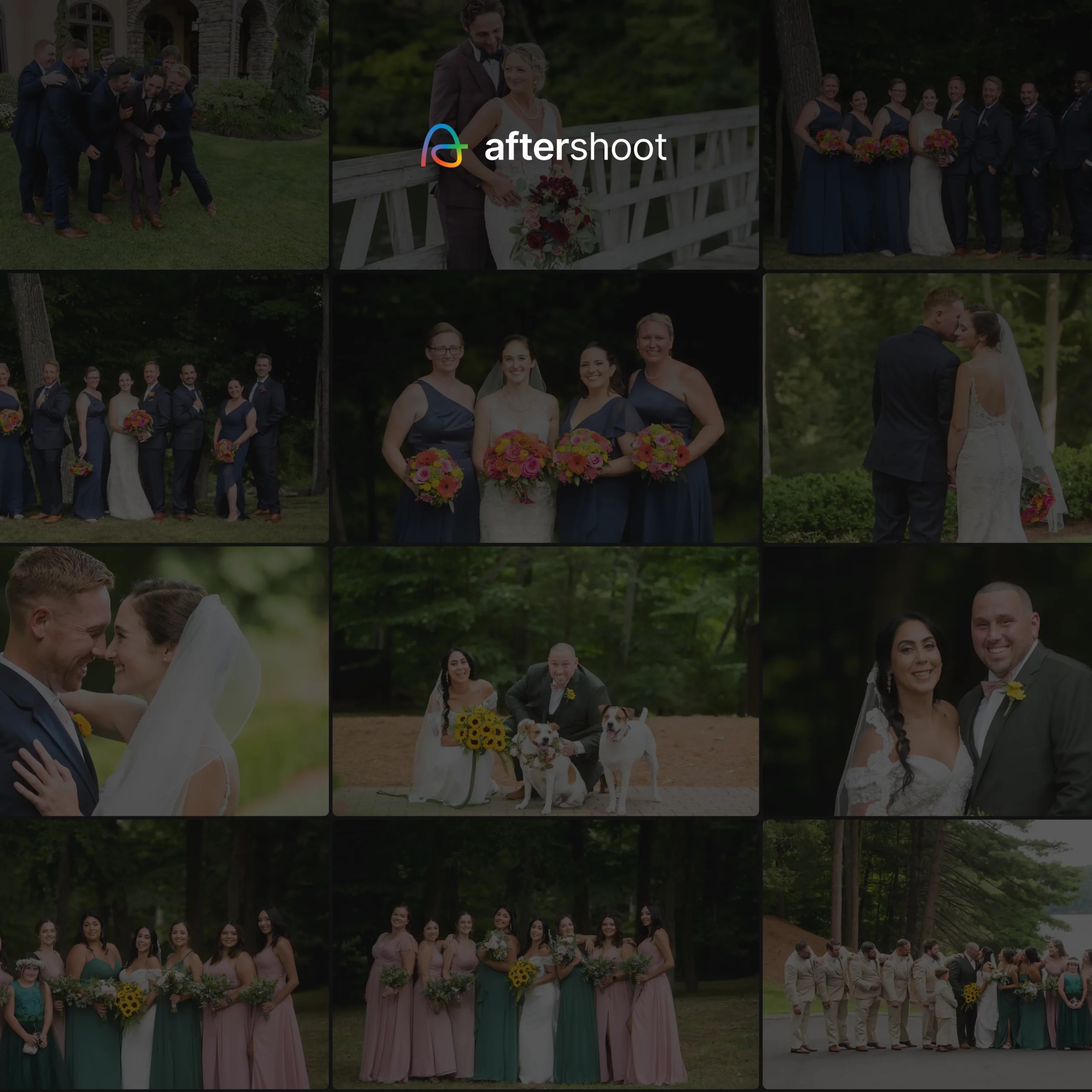
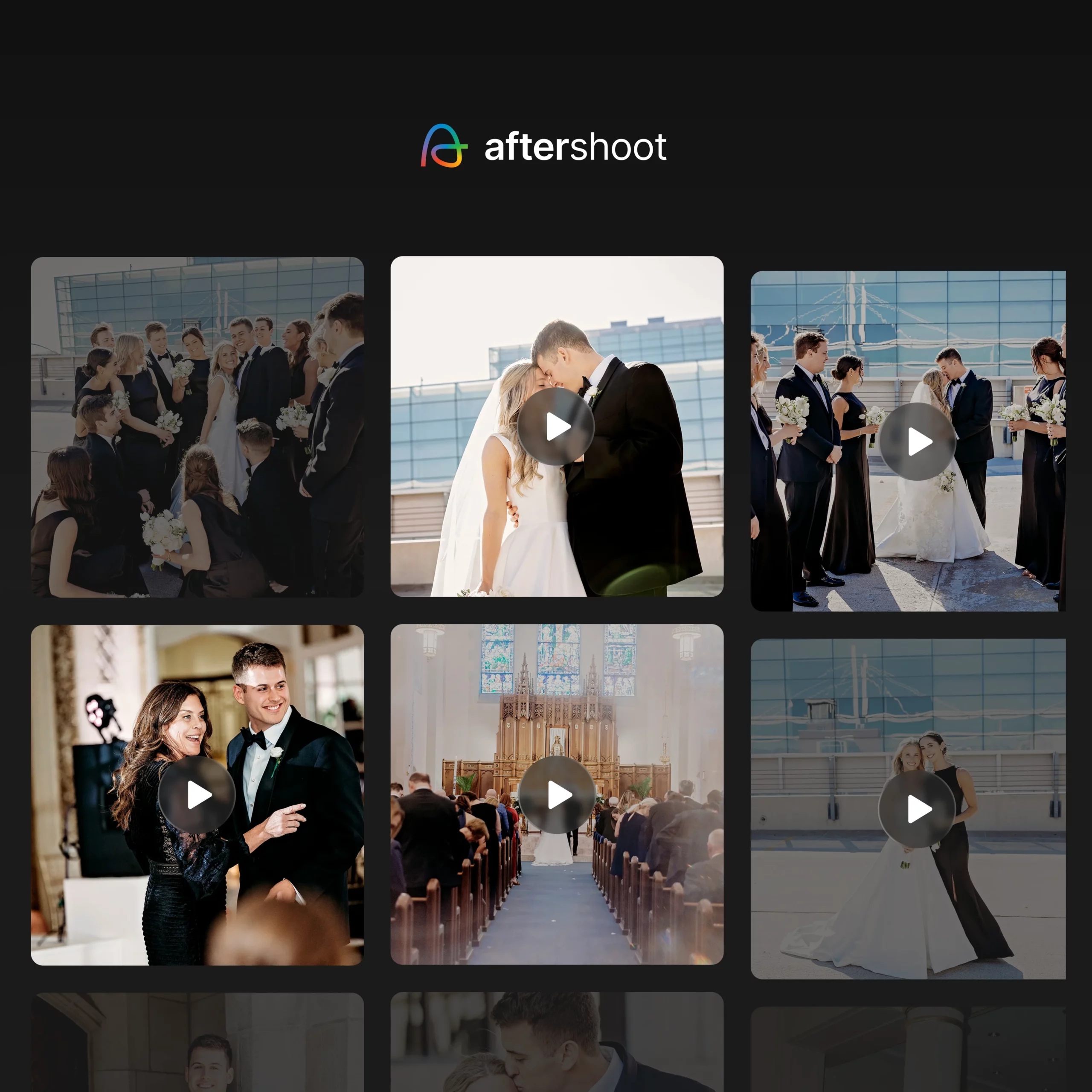
Rather than slapping a uniform color filter over a whole image, split toning shifts the color balance of your highlights and shadows independently. For example, pushing warm orange into the highlights while dropping cool teal into the shadows creates natural depth and a cinematic feel, all while leaving the midtones largely neutral.

Because true whites and true blacks resist the tint, split toning preserves your image’s contrast. It’s the technique behind the moody editorial looks and warm, filmic wedding galleries that dominate the industry today.
How to Apply Split Toning Step-by-Step
Most editing software, including Lightroom and Capture One, features a dedicated color grading or split toning panel. While the interfaces vary slightly, the workflow remains the same across the board.
- Open your editor’s split toning or color grading panel.
- Select a hue for your highlights using the color wheel or slider, then push the saturation up just enough so the tint is visible.
- Select a contrasting or complementary hue for your shadows, again raising the saturation slowly.
- Adjust the balance slider to dictate whether the highlight or shadow tone dominates the overall image.
- Zoom in to 100% on skin tones to ensure the effect hasn’t caused unnatural color shifts.
The secret to professional split toning is subtlety. You want the effect to feel like a natural consequence of the lighting, not an aggressive digital filter.
Popular Split Toning Combinations
If you are just starting to experiment with tonal separation, here are the industry-standard color pairings that consistently yield good results.
- Teal shadows with orange highlights
The definitive cinematic look, perfect for editorial and lifestyle work.
- Warm amber highlights with soft brown shadows
The go-to for modern wedding and portrait photography.
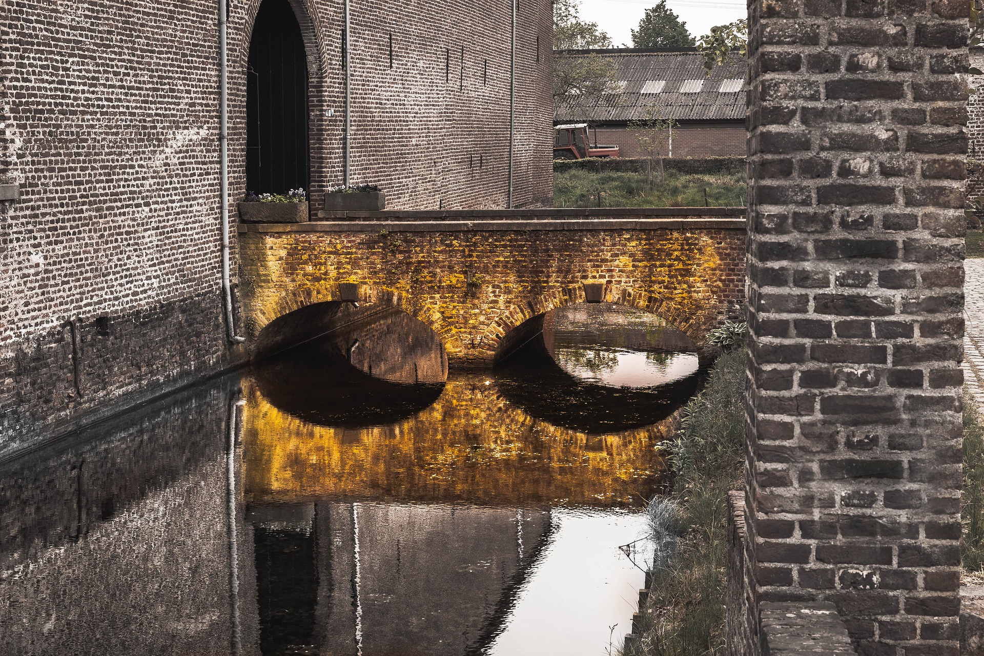
- Cool blue shadows with neutral highlights
Ideal for moody, atmospheric landscapes and street scenes.
- Monochromatic warm tones
A safe, subtle approach for portraits that protects delicate skin tones.
Scaling Your Split Toning Style with Aftershoot Edit
The step-by-step process above works beautifully for a single portfolio image. But if you are delivering a 1,000-image wedding gallery, manually tweaking highlight and shadow hues on every photo is a massive waste of time, and it gets worse if lighting shifts scene to scene. This is where your workflow breaks down, and where Aftershoot Edit steps in, now offering a complete solution.
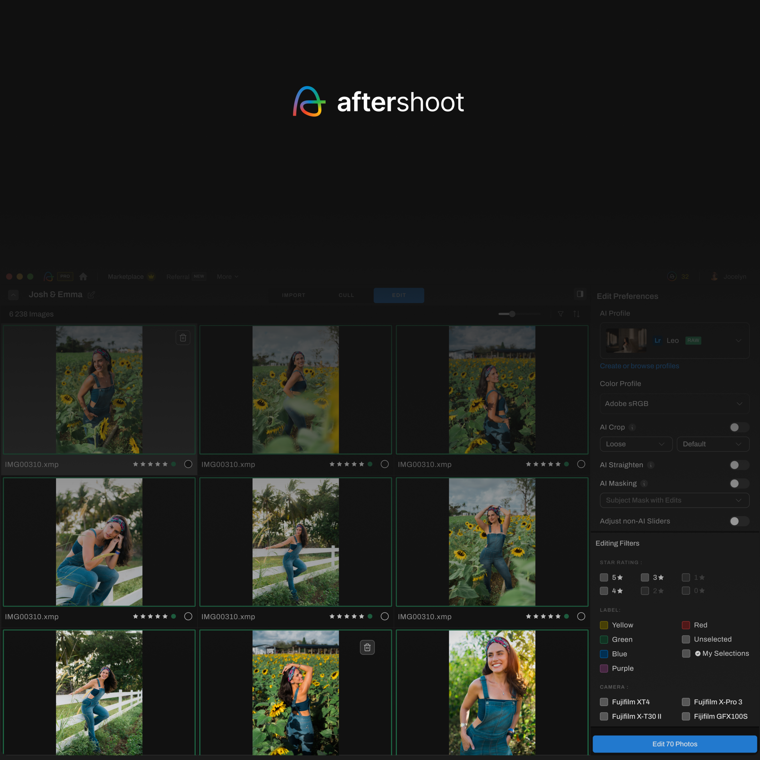
With the addition of Aftershoot Develop, Aftershoot Edit includes full manual Color Grading sliders directly inside the app, alongside White Balance, HSL, and Detail controls. This means you can dial in your exact split-toning recipe, hue, saturation, and balance for both highlights and shadows, without ever needing to open Lightroom or Capture One. You can apply that manual grade to a single image, then use Sync to push the same split-tone settings across the rest of your gallery in seconds.
This pairs directly with the platform’s improved White Balance Consistency, which ensures similar images shot in the same scene render with matching color tones before your split-toning grade is even applied. Since split toning is layered on top of your base white balance, starting from a consistent foundation means your teal-and-orange or warm-amber recipe reads identically across every frame, rather than shifting subtly image to image due to underlying white balance drift. For wedding and event photographers shooting hundreds of frames under changing light, this alone removes a major source of post-edit correction.
Beyond color, Aftershoot Edit’s improved Aggressive Cropping mode tightens compositions automatically, which complements a strong split-toning style by keeping the viewer’s eye locked on the subject rather than distracted by loose framing. Together, these updates mean you can define your creative style once, using Aftershoot’s manual sliders or a trained Custom Profile, and let the platform handle consistent, gallery-wide execution.
Common Split Toning Mistakes to Avoid
Even seasoned professionals can ruin a good edit by forcing a split-tone effect. Keep an eye out for these workflow traps.
- Oversaturating the tones: Heavy-handed saturation instantly makes the image look amateur and artificially filtered.
- Ruining skin tones: Aggressive shadow toning, particularly with greens or heavy blues, can easily bleed into complexions.
- Forcing one style everywhere: A split-tone recipe that works for golden hour portraits will likely ruin a flash-lit indoor reception shot.
- Skipping gallery consistency checks: Manually applying split tones often leads to mismatched moods across a single shoot, especially when underlying white balance varies between frames.
Split Toning vs Color Grading: What’s the Difference?
While photographers often use the terms interchangeably, they refer to different levels of control.
| Aspect | Split Toning | Color Grading |
| Scope | Highlights and shadows only | Highlights, midtones, and shadows separately |
| Complexity | Fast, two-zone adjustment | Granular, multi-zone control |
| Typical Use | Quick mood shifts | Complex cinematic finishing |
Split toning is effectively the entry point to full color grading. It offers 80% of the visual impact for a fraction of the effort, making it the most practical choice for high-volume editing workflows, and Aftershoot Develop’s manual Color Grading panel now lets you execute either approach without leaving the app.
Ultimately, split toning is about defining your visual brand. By mastering the technique and using Aftershoot Edit’s manual sliders, Sync tool, and consistency improvements to handle the batch processing, you can deliver a distinct, cohesive style without spending your entire week tethered to your desk.
Frequently Asked Questions About Split Toning
1. What is the difference between split toning and color grading?
Split toning is a foundational technique that applies distinct colors only to the highlights and shadows of an image. Color grading is an evolution of this process that offers more granular control, typically allowing you to adjust the hues of the highlights, shadows, and midtones independently.
2. Where is the split toning panel in Lightroom?
In newer versions of Adobe Lightroom Classic, the traditional Split Toning panel was replaced by the Color Grading panel. To achieve a classic split-tone effect, simply use the highlight and shadow color wheels to apply your hues and leave the midtone wheel untouched.
3. Does split toning work better on RAW or JPEG files?
Split toning always works best on RAW files. Because RAW files retain maximum color and luminance data from your camera sensor, you can push highlight and shadow hues much further without causing image degradation or color banding. Software like Aftershoot Develop allows you to apply these split-toning adjustments directly to RAW files natively.
4. What are the best split toning color combinations for portraits?
For portrait photography, warm monochromatic combinations are usually best to protect delicate skin tones. Adding soft amber to the highlights and a warm brown to the shadows is a popular choice for weddings. Photographers should avoid heavy greens or blues in the shadows, as these can bleed into the skin and make subjects look sickly.
5. Can split toning fix bad white balance or lighting?
No, split toning is a stylistic choice that should only be applied after your image is properly color-corrected. If your underlying white balance is inconsistent, your split-tone effect will look different from image to image. This is why AI tools that ensure white balance consistency across a shoot are critical before applying a final color grade.
6. Why do cinematic photos use teal and orange split toning?
Teal and orange sit opposite each other on the color wheel, making them complementary colors. Because human skin naturally falls in the orange/warm spectrum, dropping cool teal into the shadows creates high color contrast. This naturally pushes the subject forward and creates a three-dimensional, cinematic look.
7. How do I batch apply split toning to an entire wedding gallery?
While you can manually sync split-toning settings across images in most editors, doing so often requires manual tweaks if the lighting changes between scenes. The most efficient method for professionals is using an AI editing platform like Aftershoot Edit, which learns your specific split-toning style and intelligently adapts it across thousands of photos in minutes.